- Konum
- Türkiye
- Konular
- 52
- Katılım
- 31 Mart 2025
- Konular
- 52
- Mesajlar
- 172
- Çözümler
- 3
- Reaksiyon puanı
- 74
- Meslek
- Yönetici
- Cinsiyet
- Erkek


XenForo için hazırlanmış eklentiler
Web radyoları için HTML tasarımlar
HeBeLe kullanım kılavuzu
Tüm özelliklerimize erişmek için şimdi bize katılın. Kaydolup giriş yaptıktan sonra konu oluşturabilir, mevcut konulara yanıt gönderebilir, diğer üyelerinize itibar kazandırabilir, kendi özel mesajlaşma programınızı edinebilir ve çok daha fazlasını yapabileceksiniz. Aynı zamanda hızlı ve tamamen ücretsizdir, peki daha ne bekliyorsunuz?
Giriş Yap Kayıt Ol
bunu deneyebilir misin?Harika süper oldu bu lakin mobilde sanki bir garip çalışıyor soldan sağa yazı çok boşluklu Destek Oyun! - Valorant Seven Dostların Mekanı! sizde bir bakar mısınız şuan aktif çalışıyor.
//Breadcrumb
.p-breadcrumbs {
    margin-bottom:15px;
    display:inline-block;
    width: 100%;
    font-size: 12px;
    border-color: @xf-borderColor; // BORDER RENGİ
    border-radius: 3px;
    overflow: hidden;
    position: relative;
    z-index: 0;
    color: @xf-textColor;
    background: @xf-contentBg; //ARKA PLAN RENGİ

    &:before {
        display: block;
        position: absolute;
        top: 0;
        left: 0;
        right: 0;
        bottom: 0;
        border: 0px;
        border-radius...
//Breadcrumb
.p-breadcrumbs {
margin-bottom:15px;
flex: 1 1 auto;
width: 100%;
font-size: 12px;
border-color: @xf-borderColor; // BORDER RENGİ
border-radius: 3px;
overflow: hidden;
position: relative;
z-index: 0;
color: @xf-textColor;
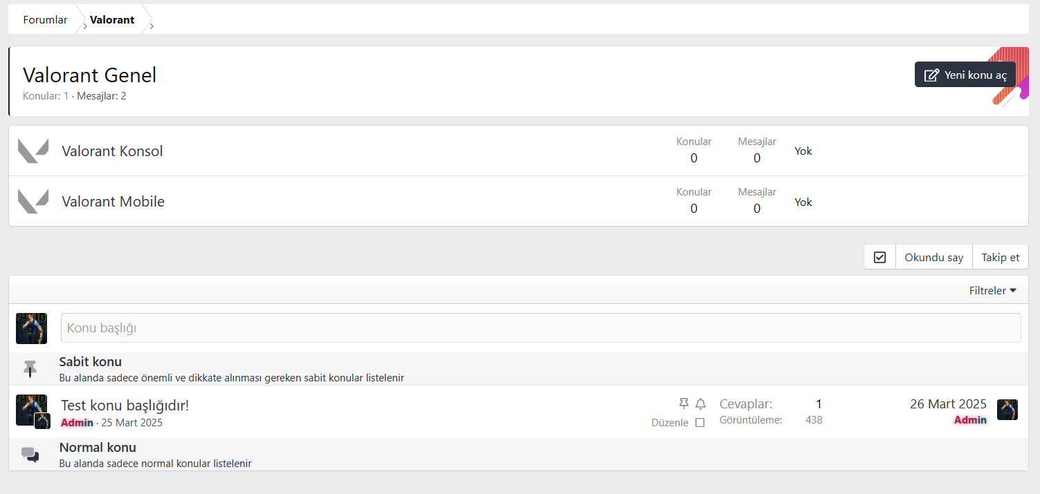
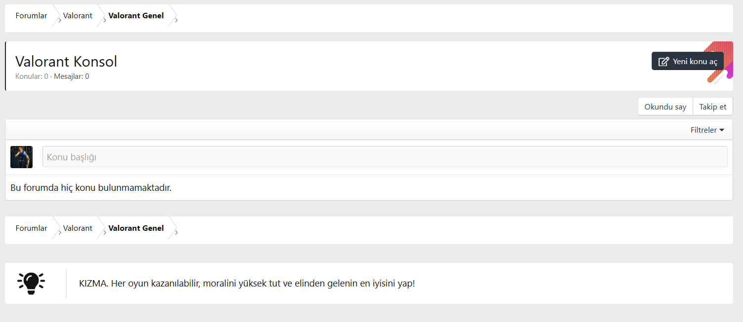
background: @xf-contentBg; //ARKA PLAN RENGİ...Denedim fakat sanki bozukluk var gibi görünğmleri de değişiyor iki adet resim bırakıyorum bakınca anlarsınızXenForo 2.x.x versiyonları için Breadcrumb alanını özelleştirme kodları. Aşağıya eklemiş olduğum kodu extra.less şablonuna ekleyerek breadcrumb alanında görünümü değiştirebilirsiniz.
Kodları ekledikten sonra aşağıdaki gibi bir görünüm olacaktır.

CSS://Breadcrumb .p-breadcrumbs { margin-bottom:15px; flex: 1 1 auto; width: 100%; font-size: 12px; border-color: @xf-borderColor; // BORDER RENGİ border-radius: 3px; overflow: hidden; position: relative; z-index: 0; color: @xf-textColor; background: @xf-contentBg; //ARKA PLAN RENGİ...
Bu konudakini deneyebilir misin?
Denedim fakat sanki bozukluk var gibi görünğmleri de değişiyor iki adet resim bırakıyorum bakınca anlarsınızXenForo 2.x.x versiyonları için Breadcrumb alanını özelleştirme kodları. Aşağıya eklemiş olduğum kodu extra.less şablonuna ekleyerek breadcrumb alanında görünümü değiştirebilirsiniz.
Kodları ekledikten sonra aşağıdaki gibi bir görünüm olacaktır.
CSS://Breadcrumb .p-breadcrumbs { margin-bottom:15px; flex: 1 1 auto; width: 100%; font-size: 12px; border-color: @xf-borderColor; // BORDER RENGİ border-radius: 3px; overflow: hidden; position: relative; z-index: 0; color: @xf-textColor; background: @xf-contentBg; //ARKA PLAN RENGİ...
Bu konudakini deneyebilir misin?
Bunu da deneyebilir misin?Denedim fakat sanki bozukluk var gibi görünğmleri de değişiyor iki adet resim bırakıyorum bakınca anlarsınız
//Breadcrumb
.p-breadcrumbs {
    margin-bottom:15px;
    flex: 1 1 auto;
    width: 100%;
    font-size: 12px;
    border-color: @xf-borderColor; // BORDER RENGİ
    border-radius: 3px;
    overflow: hidden;
    position: relative;
    z-index: 0;
    color: @xf-textColor;
    background: @xf-contentBg; //ARKA PLAN RENGİ
    max-height:48px;

    &:before {
        display: block;
        position: absolute;
        top: 0;
        left: 0;
        right: 0;
        bottom: 0;
        border: 0px;
        border-radius: inherit;
        pointer-events: none;
        z-index: 2;
    }

    li {
        margin: 0;
        padding-left: 15px;
        float: left;
        margin-right: -1.5em;
        font-size: 13px;

        &:first-of-type {
            a {
                margin-left: -20px;
                &:before, &:after {
                    width: calc(100% + 20px);
                }
            }
        }

        &:after {
            display: none;
        }

        a {
            padding: 10px 15px;
            position: relative;
            z-index: 1;
            display:inline-block;
            overflow: visible;
            max-width: none;
            text-decoration: none;
            color: inherit;
            margin-left: 5px;

            &:before {
                top: 0;
                transform: skewX(35deg);
            }

            &:after {
                top: 50%;
                transform: skewX(-35deg);
            }

            &:before, &:after {
                border-style: solid;
                border-width: 0;
                border-right-width: 1px;
                box-shadow: inset currentColor -1px 0px 0px 0px;
                content: '';
                position: absolute;
                height: 50%;
                width: 100%;
                right: 0;
                z-index: -1;
                box-sizing: border-box;
                transform-origin: 100% 50%;
                border-color: @xf-contentAltBg;
                color: @xf-borderColor;
            }
            &:hover:before, &:hover:after {
                background: darken(@xf-contentAltBg, 15%); //Hover Rengi
            }
            &:hover {
                background: transparent;
            }
        }
    }
}

@media (max-width: @xf-responsiveNarrow) {
    .p-breadcrumbs {
        li {
            &:before {
                display:none;
            }

            a:before {
                top: 0;
                transform: skewX(-35deg);
                width: calc(100% + 20px);
            }

            a:after {
                top: 50%;
                transform: skewX(35deg);
                width: calc(100% + 20px);
            }
        }
    }
}Harika süper oldu bu lakin mobilde sanki bir garip çalışıyor soldan sağa yazı çok boşluklu Destek Oyun! - Valorant Seven Dostların Mekanı! sizde bir bakar mısınız şuan aktif çalışıyor.Bunu da deneyebilir misin?
CSS://Breadcrumb .p-breadcrumbs { margin-bottom:15px; flex: 1 1 auto; width: 100%; font-size: 12px; border-color: @xf-borderColor; // BORDER RENGİ border-radius: 3px; overflow: hidden; position: relative; z-index: 0; color: @xf-textColor; background: @xf-contentBg; //ARKA PLAN RENGİ max-height:48px; &:before { display: block; position: absolute; top: 0; left: 0; right: 0; bottom: 0; border: 0px; border-radius: inherit; pointer-events: none; z-index: 2; } li { margin: 0; padding-left: 15px; float: left; margin-right: -1.5em; font-size: 13px; &:first-of-type { a { margin-left: -20px; &:before, &:after { width: calc(100% + 20px); } } } &:after { display: none; } a { padding: 10px 15px; position: relative; z-index: 1; display:inline-block; overflow: visible; max-width: none; text-decoration: none; color: inherit; margin-left: 5px; &:before { top: 0; transform: skewX(35deg); } &:after { top: 50%; transform: skewX(-35deg); } &:before, &:after { border-style: solid; border-width: 0; border-right-width: 1px; box-shadow: inset currentColor -1px 0px 0px 0px; content: ''; position: absolute; height: 50%; width: 100%; right: 0; z-index: -1; box-sizing: border-box; transform-origin: 100% 50%; border-color: @xf-contentAltBg; color: @xf-borderColor; } &:hover:before, &:hover:after { background: darken(@xf-contentAltBg, 15%); //Hover Rengi } &:hover { background: transparent; } } } } @media (max-width: @xf-responsiveNarrow) { .p-breadcrumbs { li { &:before { display:none; } a:before { top: 0; transform: skewX(-35deg); width: calc(100% + 20px); } a:after { top: 50%; transform: skewX(35deg); width: calc(100% + 20px); } } } }
bunu deneyebilir misin?Harika süper oldu bu lakin mobilde sanki bir garip çalışıyor soldan sağa yazı çok boşluklu Destek Oyun! - Valorant Seven Dostların Mekanı! sizde bir bakar mısınız şuan aktif çalışıyor.
//Breadcrumb
.p-breadcrumbs {
    margin-bottom:15px;
    display:inline-block;
    width: 100%;
    font-size: 12px;
    border-color: @xf-borderColor; // BORDER RENGİ
    border-radius: 3px;
    overflow: hidden;
    position: relative;
    z-index: 0;
    color: @xf-textColor;
    background: @xf-contentBg; //ARKA PLAN RENGİ

    &:before {
        display: block;
        position: absolute;
        top: 0;
        left: 0;
        right: 0;
        bottom: 0;
        border: 0px;
        border-radius: inherit;
        pointer-events: none;
        z-index: 2;
    }

    li {
        margin: 0;
        padding-left: 15px;
        float: left;
        margin-right: -1.5em;
        font-size: 13px;

        &:first-of-type {
            a {
                margin-left: -15px;
                &:before, &:after {
                    width: calc(100% + 20px);
                }
            }
        }

        &:after {
            display: none;
        }

        a {


            padding: 10px 15px;
            position: relative;
            z-index: 1;
            display:inline-block;
            overflow: visible;
            max-width: none;
            text-decoration: none;
            color: inherit;
            margin-left: 5px;

            &:before {
                top: 0;
                transform: skewX(35deg);
            }

            &:after {
                top: 50%;
                transform: skewX(-35deg);
            }

            &:before, &:after {
                border-style: solid;
                border-width: 0;
                border-right-width: 1px;
                box-shadow: inset currentColor -1px 0px 0px 0px;
                content: '';
                position: absolute;
                height: 50%;
                width: 100%;
                right: 0;
                z-index: -1;
                box-sizing: border-box;
                transform-origin: 100% 50%;
                border-color: @xf-contentAltBg;
                color: @xf-borderColor;
            }
            &:hover:before, &:hover:after {
                background: darken(@xf-contentAltBg, 15%); //Hover Rengi
            }
            &:hover {
                background: transparent;
            }
        }
    }
}

@media (max-width: @xf-responsiveNarrow) {
    .p-breadcrumbs {
        li {
            &:before {
                display:none;
            }

            a:first-of-type {
                margin-left: -20px;
            }

            a:before {
                top: 0;
                transform: skewX(-35deg);
                width: calc(100% + 20px);
            }

            a:after {
                top: 50%;
                transform: skewX(35deg);
                width: calc(100% + 20px);
            }
        }
    }
}Adminim süpersin hem mobil hem tarayıcı şuan harika muhteşem oldu hatasız.bunu deneyebilir misin?
CSS://Breadcrumb .p-breadcrumbs { margin-bottom:15px; display:inline-block; width: 100%; font-size: 12px; border-color: @xf-borderColor; // BORDER RENGİ border-radius: 3px; overflow: hidden; position: relative; z-index: 0; color: @xf-textColor; background: @xf-contentBg; //ARKA PLAN RENGİ &:before { display: block; position: absolute; top: 0; left: 0; right: 0; bottom: 0; border: 0px; border-radius: inherit; pointer-events: none; z-index: 2; } li { margin: 0; padding-left: 15px; float: left; margin-right: -1.5em; font-size: 13px; &:first-of-type { a { margin-left: -15px; &:before, &:after { width: calc(100% + 20px); } } } &:after { display: none; } a { padding: 10px 15px; position: relative; z-index: 1; display:inline-block; overflow: visible; max-width: none; text-decoration: none; color: inherit; margin-left: 5px; &:before { top: 0; transform: skewX(35deg); } &:after { top: 50%; transform: skewX(-35deg); } &:before, &:after { border-style: solid; border-width: 0; border-right-width: 1px; box-shadow: inset currentColor -1px 0px 0px 0px; content: ''; position: absolute; height: 50%; width: 100%; right: 0; z-index: -1; box-sizing: border-box; transform-origin: 100% 50%; border-color: @xf-contentAltBg; color: @xf-borderColor; } &:hover:before, &:hover:after { background: darken(@xf-contentAltBg, 15%); //Hover Rengi } &:hover { background: transparent; } } } } @media (max-width: @xf-responsiveNarrow) { .p-breadcrumbs { li { &:before { display:none; } a:first-of-type { margin-left: -20px; } a:before { top: 0; transform: skewX(-35deg); width: calc(100% + 20px); } a:after { top: 50%; transform: skewX(35deg); width: calc(100% + 20px); } } } }
